
Foodie Fanatic - App Redesign
1. Project Overview
Goal: Design a user-friendly mobile experience for FoodieFanatic, a community-driven app connecting food lovers, chefs, and brands.
Outcome: A high-fidelity interactive prototype demonstrating seamless recipe discovery, personalized recommendations, and social interaction features.
Role: UI/UX Designer — end-to-end design from research and persona development to wireframing and prototyping.

2. Context & Problem
Users faced challenges navigating complex recipe and product ecosystems — cluttered layouts, irrelevant suggestions, and lack of community feedback loops.
The challenge was to create a clear information architecture and engaging visual design that supports discovery and trust.

3. Research & User Personas
To create an intuitive and meaningful product experience, I began by developing a set of user personas based on qualitative research and behavioral insights gathered from interviews and surveys. The goal was to identify distinct motivations, challenges, and expectations of different user groups. This process helped humanize design decisions, ensuring that each feature directly addressed real pain points rather than assumptions. The resulting personas — Deborah, Riz, and Valerie �— represent a spectrum of users ranging from luxury-seeking food connoisseurs to practical home cooks and creative culinary influencers.


4. Design Prototypes — From Insight to Interaction
Guided by these personas, I translated research insights into tangible design solutions. Through iterative sketching, wireframing, and prototyping, I focused on creating a smooth and visually engaging experience that balances exploration with efficiency. Each prototype was tested to refine navigation, filtering, and visual hierarchy, emphasizing clarity and delight in every interaction. The final high-fidelity prototype reflects a unified design system where users can effortlessly discover, evaluate, and share food-related content.


User Interaction Scenarios — Bridging Personas and Prototypes
Each persona’s goals and behaviors informed how they would navigate the app, shaping specific interaction pathways:
Deborah uses the filtering and review features to quickly identify premium chefs and trending culinary products that align with her brand-conscious lifestyle.
Riz interacts primarily with recipe discovery and video tutorials, benefiting from simplified navigation and categorized search results that support quick learning.
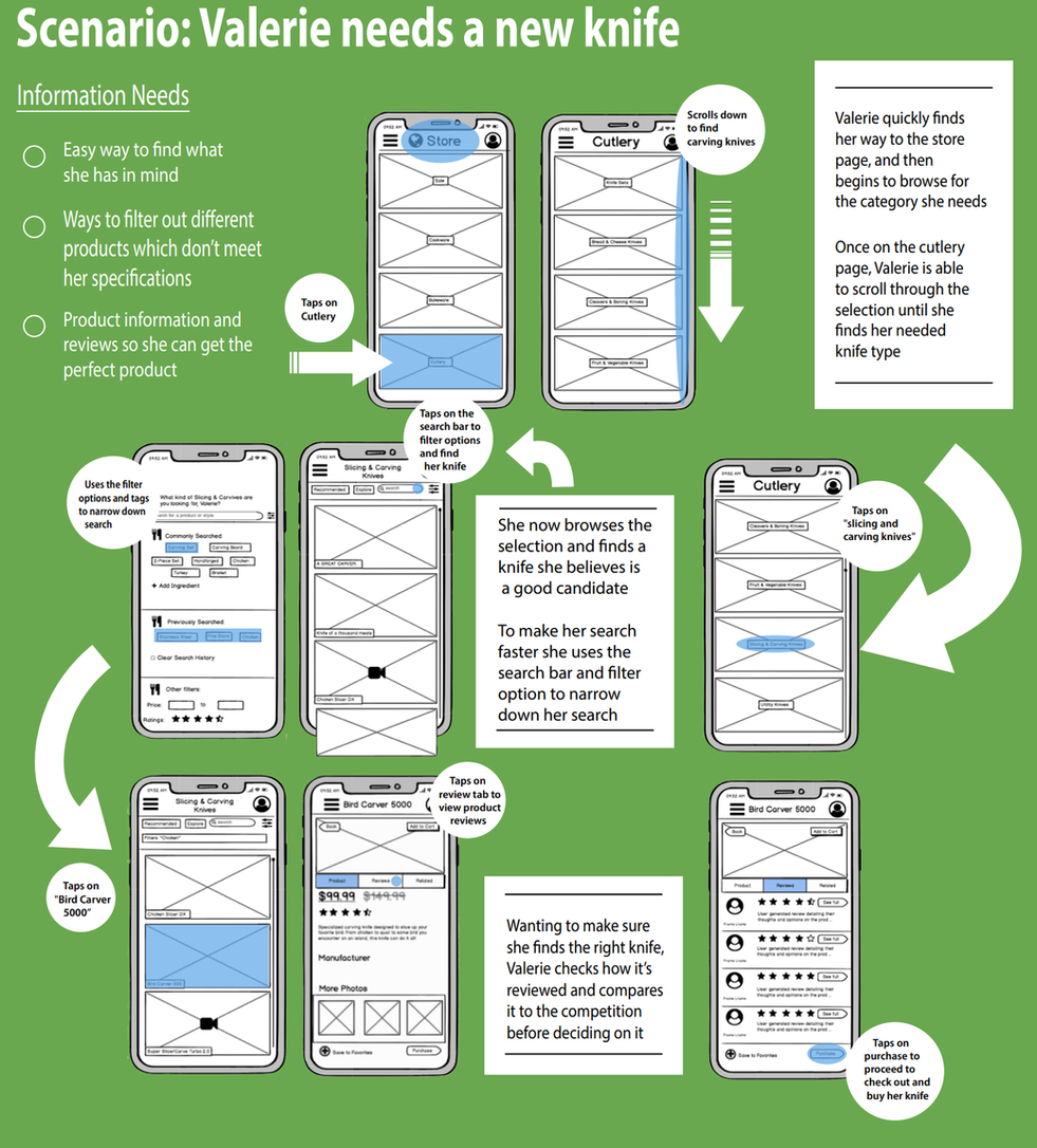
Valerie leverages community discussion threads and product review sections to exchange creative ideas and find specialized kitchen tools for her content creation.
These interactions validated that the prototype successfully accommodates diverse user motivations — from curation to learning to creation — all within a cohesive and intuitive mobile experience.


6. Feedback & Reflections — Iteration Through Insight
Throughout the project, continuous feedback played a central role in refining both functionality and visual design. Early usability testing with target users revealed key opportunities for improvement — such as simplifying category labels, reducing visual clutter, and optimizing the filtering interface for quicker decision-making. Incorporating this feedback led to a more seamless navigation flow and increased overall user satisfaction.
Reflecting on the process, this project reinforced the importance of designing with empathy — not just for efficiency, but for emotional connection. Each persona guided critical design decisions that balanced practicality with delight. I learned that great UX isn’t just about removing friction, but about crafting meaningful moments that empower users to reach their goals confidently.
Moving forward, I aim to integrate more data-driven validation (A/B testing, analytics) alongside qualitative feedback to complement my design intuition. The prototype became a reminder that iteration is not a phase, but a mindset — one that turns insights into impactful, human-centered solutions.